What will be your design legacy?
/Architects and builders have never before had so many cladding material options to deliver the look they’re after. But there are other objectives that structures must meet beyond only the aesthetic. Wouldn’t it be great if there was a cladding material that was capable of delivering both visually and functionally in virtually any style? And, what if that material could help you, as a designer, leave your mark well into the future by steadfastly representing your vision for perhaps centuries?
Good news! Technological development has brought this material to us…millennia ago. It’s fired clay brick.
You’ll be forgiven for assuming that such an old material can’t possibly pull off innovative and contemporary designs, but that’s one of brick’s super powers. Its many sizes, shapes, colors and textures offer greater design flexibility than any other material, and nothing can beat it for durability, low-maintenance, and sustainability. As centuries-old brick structures around the world demonstrate, your creation is much more likely to be around well into the future, authentically expressing your original design, when it’s built with brick.
The projects highlighted below are a sample of notable and award-winning brick designs that will serve as a lasting legacy for their designers, potentially for centuries. Isn’t it time you worked on your legacy?
Globe Life Field
Arlington, Texas
Brick Manufacturer: Acme Brick Company
Architect: HKS Inc (design architect, architect of record)
Associate Architect: VLK Architects
Mason: DMG Masonry
Photographer: Louis E. Curtis Jr., Spencer Martinez
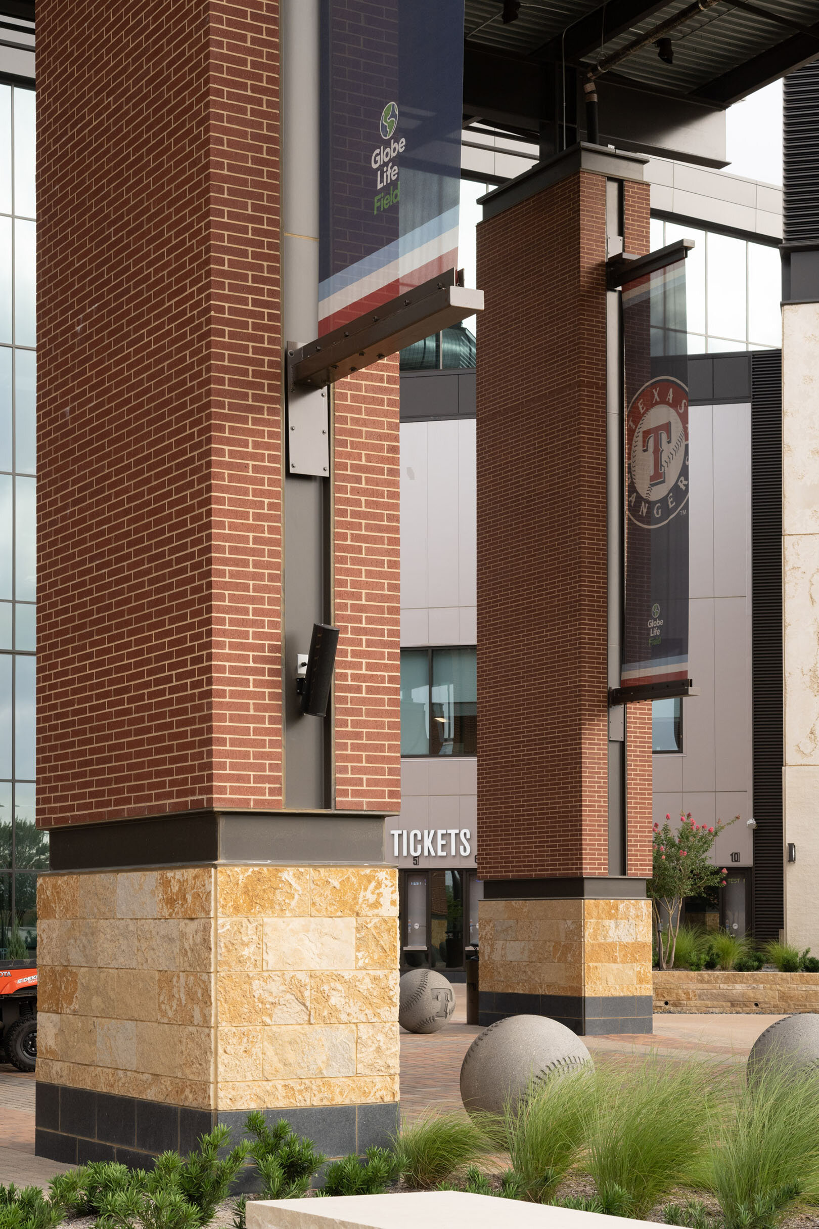
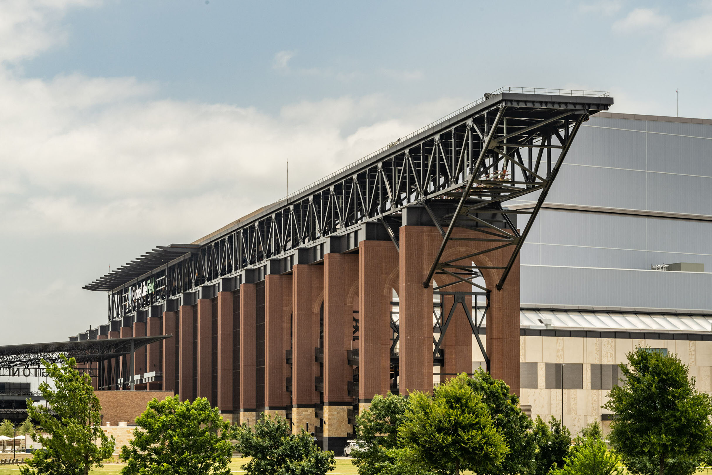
Designed by the same architects who created its predecessor, Globe Life Field was a chance to apply user lessons from the original Globe Life Park. Brick was one feature that carried through and became celebrated even more. What was left out? About nine thousand seats to make a more intimate setting, and all that triple-digit Texas summer heat, with the addition of a retractable roof and air- conditioning. Now, 1.7 million square feet and 40,000 seats fit underneath a daylight-feeling enclosure at a perfect 72 degrees when closed. Designed as a multipurpose venue, the stadium hosts football, soccer, basketball, concerts, and conventions, not to mention the first neutral-site World Series in more than 70 years. Key to the open-air look and environment are monumental colonnades and archways faced in brick. The material connects to the stadium’s much loved predecessor and to the history of the towns and cities of the area. Brick fulfilled the team’s goal that the roof not be the focal point of the new venue. Soaring brick arches, which form an indoor/outdoor colonnade and extend outward sculpturally to support the roof’s sliding track, are the building’s front door, its main facade, and the backdrop for seating and the playing field inside. Brick contributes to the team’s desired Texas flavor and intimate, backyard family feel. Ample concourses, whose perimeters are lined by brick archways, offer great staging and maneuverability in response to COVID-19 social distancing protocols. Multiple gateways at the perimeter of the ballpark, defined by Texas-sized porches, start fans on a journey with access to both the main and upper concourses. One feature, the 80-by-20- foot out-of-town board on the center field wall, was the old left field scoreboard at Globe Life Park and preserves that park’s legacy, along with the arches on the new stadium’s north façade. Baseball may be the defining purpose of the new stadium, but rich red brick will always be its defining image.
Cloud County Historical Museum
Concordia, Kansas
Brick Manufacturer: Cloud Ceramics/Kansas Brick & Tile
Designer/Sculptor: Catharine Magel, Mara Smith
Mason: David Fleming, Fleming Masonry Construction
In 2003, the Cloud County Historical Society purchased a former downtown Concordia hardware store with intentions to expand the existing Cloud County Historical Museum. After reviewing several options for a wall mural, it was decided to use carved brick as Concordia is the home of Cloud Ceramics. Finished in June of 2009, the mural is comprised of 6,400 carved bricks and measures 140 feet long with five sections 15 feet high and two sections 20 feet high. The mural depicts many historical landmarks as well as key elements of Cloud County. One section even highlights the impact of Cloud Ceramics on the community as you see workers stacking green brick in a beehive kiln. The whole wall mural is touted as the longest sculpted brick mural in the US.
The option for brick sculpture further broadens the palette of the architect designing in clay brick. While endless combinations of color, texture, and bond pattern give the designer unprecedented flexibility for expressing the overall form of a building, brick sculpture allows for more explicit communication of the structure’s design themes.
K-8 Replacement School
Skokie, Illinois
Brick Manufacturer: Endicott Clay Products Company
Brick Distributor: Illinois Brick Company
Architect: STR Partners LLC
Mason: Mastership Construction Company Inc.
Photographer: Christopher Barrett Photography
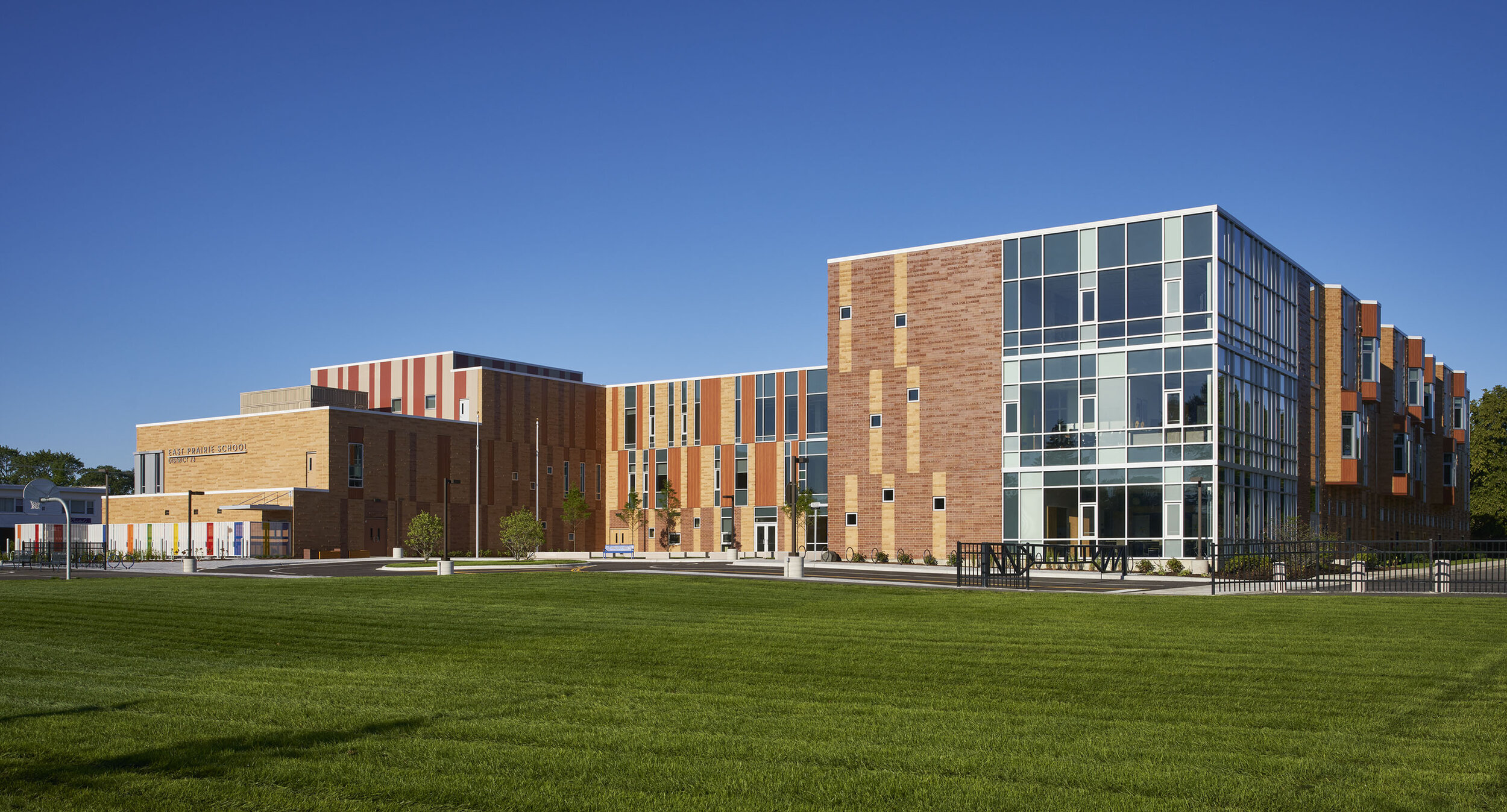
The brown and red brick exterior of this new K-8 replacement school reflects the color palette of the surrounding commercial and residential neighborhood. A 3-story design naturally divides the grade levels per floor: the first floor for K-2, the second floor for 3-5, and the third floor for 6-8. Window heights increase with each floor level, while the first floor has small, punched-out windows for a feeling of security. Red, blue, green, yellow, and orange glazed bricks frame these smaller, “building block” windows on the ground floor for the youngest primary students, while bay windows undulate along the second and third floors where older students can be found reading on the bench seating inside.
The exterior design is meant to evoke the forest that surrounds the urban environment inside the school. The horizontal brick pattern represents the earth, while the vertical wood-look cladding on the upper floors represents the forest. The building has a U-shaped footprint with the front entry facing east towards a quiet residential street to provide shelter from busy principal roads, creating a secure “learning forest” for students.
The exterior of the building is clad almost entirely in brick as a symbolic representation of solidity and the importance that the community places in its children and their education. It was also important to the community that the structure blend with the aesthetic of the surrounding, mostly brick-façade neighborhood. Two colors of brick were selected for the majority of the façade (Endicott Desert Light Iron and Endicott Desert Medium Iron Spot), both of which came in smooth and artisan textures. The artisan bricks were laid in a striping, horizontal pattern covering most of the exterior, interrupted only by a wood-look cladding along the upper floors, like trees in a forest. The smaller windows dotting the ground floor are framed by brightly colored glazed brick evoking building blocks and childhood.
St. Martha’s Catholic Church
Porter, Texas
Brick Manufacturer: Hebron Brick
Achitect: Turner Duran Architects
Mason: WINCO Masonry, Inc.
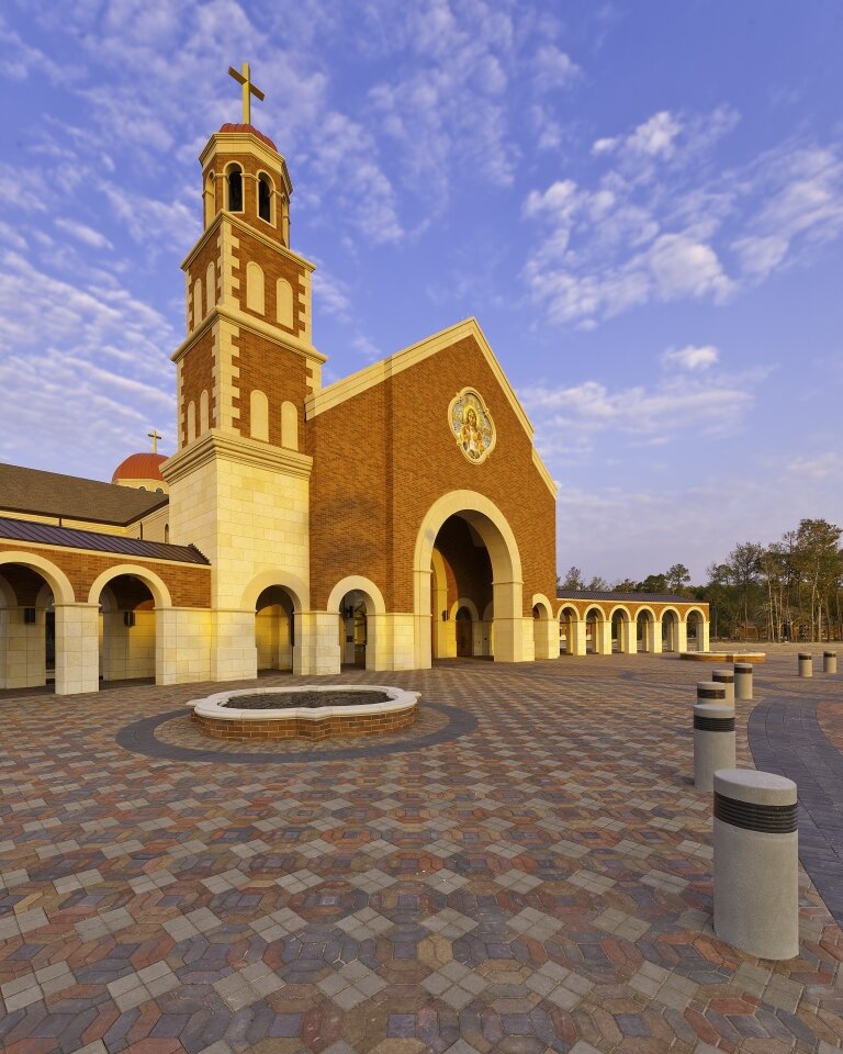
While brick can fill many roles in virtually any architectural style, there’s no material that does “traditional” better. When parishioners’ of St. Martha’s Catholic Church in Porter, Texas said they wanted a “church that looks like a church,” Turner Duran Architects responded with a 40,000 square foot design that called on fired clay brick for its familiarity and permanence. On the inside, though, the structure needed to function within the contemporary Roman Catholic liturgy which has led many other congregations toward much less traditional church designs in the last several decades.
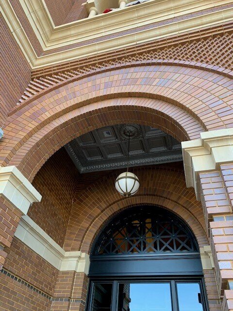
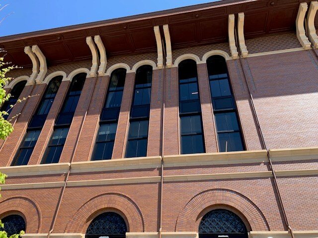
The building uses a Renaissance Italian theme while calling on the architectural history of a variety of Catholic worship spaces from around the world. Arches are prominent in the design, both in the windows that light the interior from four sides and in the covered ambulatory that embraces a wide, open plaza, just as God embraces his Church.
The mass of brick masonry on the exterior gives way gradually to light-colored stone paving and glue-laminated wood trusses on the inside, with brick serving as both the outer and interior cladding of the building’s main entrance before blending into complimentary materials. The church’s substantial facade of brick and stone, perhaps displayed most prominently on the bell tower, sends an unmistakable message of welcome and steadfastness to the surrounding community.
University of Kansas Medical Center Health Education Building
Kansas City, Kansas
Brick Manufacturer: Sioux City Brick (a Premier Division of Glen Gery Corporation)
Architect: CO Architects
Mason: Five Stair Masonry
Photographer: Bill Timmerma
The Health Education Building is an interdisciplinary, multipurpose education facility serving the University of Kansas schools of medicine, nursing and health professions.
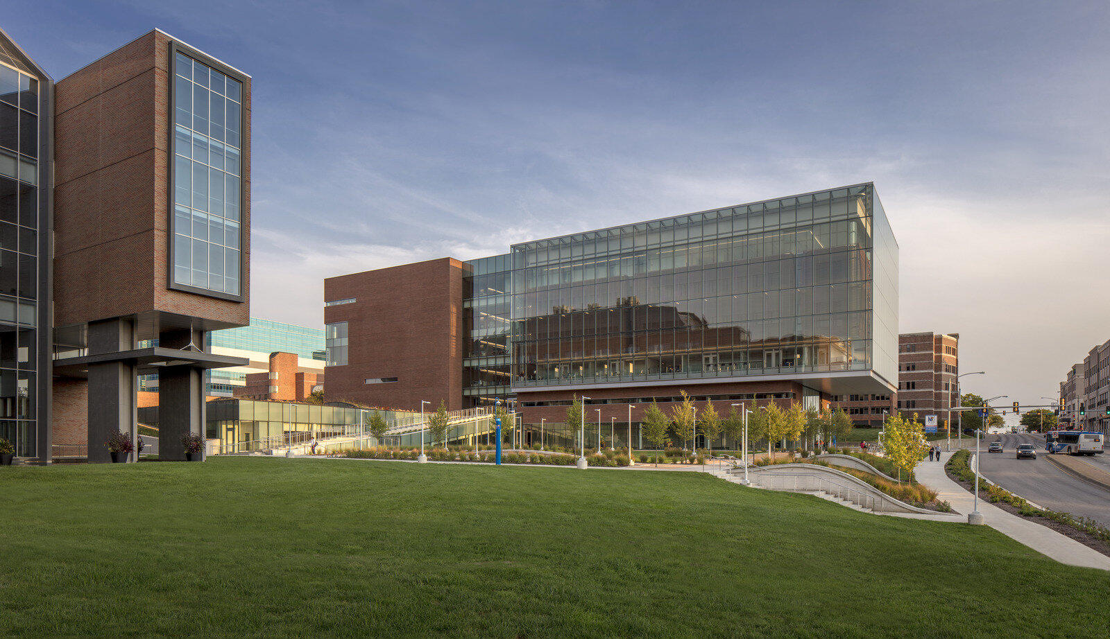
Prominently located at the entrance to the medical campus on the corner of two busy roads, the new building has emerged as a new geographical center at the nexus of existing clinical, research and education buildings. The design enhances existing circulation paths and creates new physical connections, achieving its goal to serve as a connective hub and front door to the campus. The existing campus buildings are predominantly brick with punched openings, although the brick varies in color, texture and construction. The Health Education Building holds and frames its strategic corner as the university’s new front door, while embedding itself in the expanded masonry context of the campus.
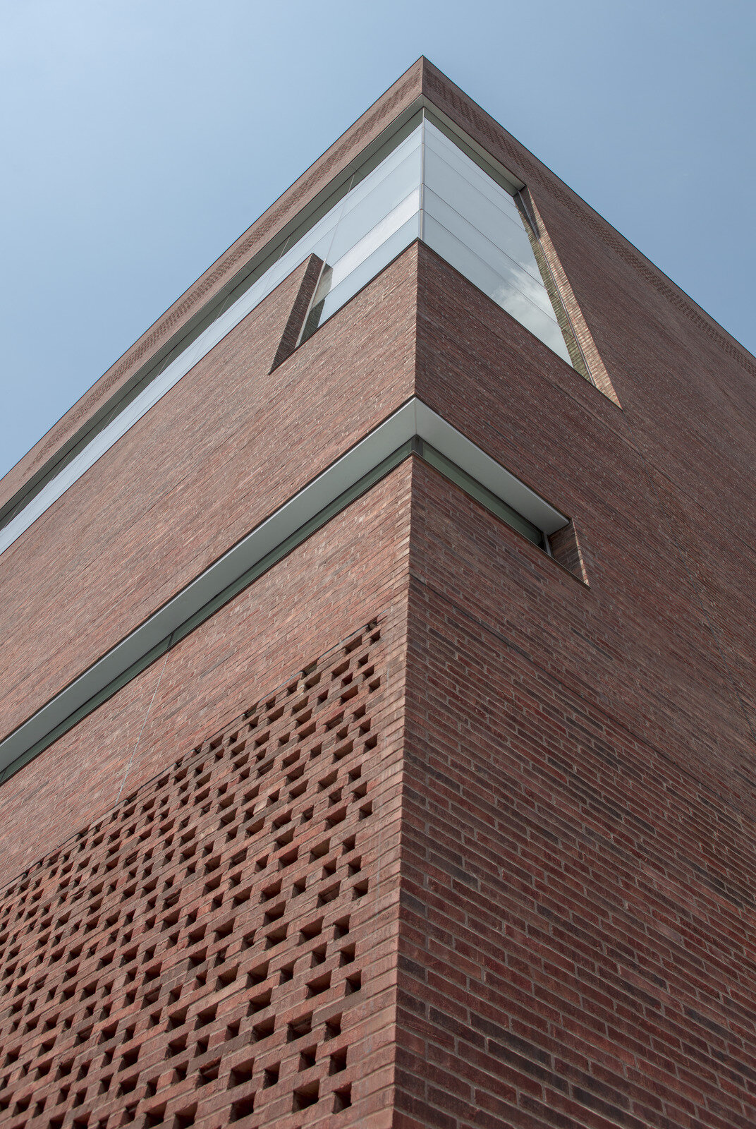
Surrounded by these variations, the new building balances the campus vernacular with a large transparent volume to the west, and a sculpted brick cube to the east. Treating the building as a monolithic sculptural mass, the use of dark brick resonates with the surrounding campus tonality, and dark mortar was used to further abstract the construction. The design team worked carefully on several on-site mock-ups to derive a blend of colors that balanced the varied tonality of brick on campus.
Long, thin Roman bricks, sourced locally, allow for the design to deploy a brick “screen” that incorporates unique design features without a change in material. On grade, this intricate brick screen brings natural light into a street-facing classroom, while filtering out the visual and acoustic distractions of the bustling avenue. At the top floor of the cube, the screen allows air intake for the building’s mechanical system, embedded within the volume. The volume of the cube is materially expressed as the brick facade carries into the elevator lobby interior, where the brick and glass volumes intersect.
The brick building seamlessly connects to the existing campus and provides a much-needed thoroughfare connecting parking facilities to the west with the heart of the campus. The building itself becomes the street, encouraging people to meet in, and move through, a vibrant civic community. It holds and frames the strategic corner, becoming the front door to the medical center. Together with existing adjoining buildings, it forms a new public square, expanding the reach and useable space for learning and social engagement. The design of the Health Education Building artfully balances the use of brick, glass and metal to create a modern, iconic presence that stands out, yet fits in. It respects the contextual brick campus while introducing a more contemporary presence. It exhibits an openness and transparency for which the design, construction and texture of the brick were critical.
Grapevine Main
Grapevine, Texas
Brick Manufacturer: Yankee Hill Brick
Architect: Architexas
Masons: DMG Masonry, Skinner Masonry
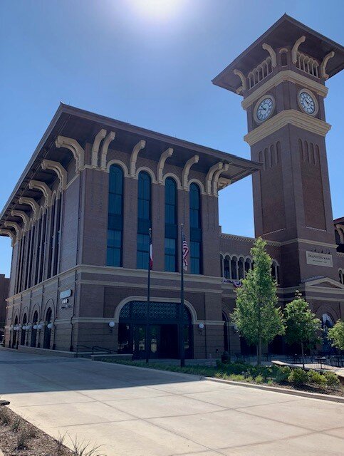
Offering a modern twist on grand, historic train stations, Grapevine Main makes extensive use of clay brick to capture the charm of the past in a series of distinctly fresh structures.
The heart of the Grapevine Main complex is a new commuter rail station at the site of the historic Cotton Belt Railroad line. It’s soaring 122-feet-tall clock tower, constructed almost entirely of brick, more than achieves the goals of the city’s leadership to establish a prominent public landmark that acknowledges the architecture of the community’s adjacent historic district and serves as its southern gateway.
The state-of-the-art station includes numerous eateries, retail and meeting space, and is flanked by the Hotel Vin, a 120 room boutique hotel. A 550 car parking structure with long term parking and service to the Dallas - Fort Worth Airport is artfully — though intentionally not seamlessly — integrated into the complex. Distinct brick color and texture combinations from Yankee Hill Brick are used on each component of the complex, giving the development an overall feel of a collection of individual structures. A variety of brick bond patterns and generous facade articulation also helps prevent the complex from blurring into a single large mass as the eye is drawn to patterns of masonry detailing that change frequently throughout the development.


